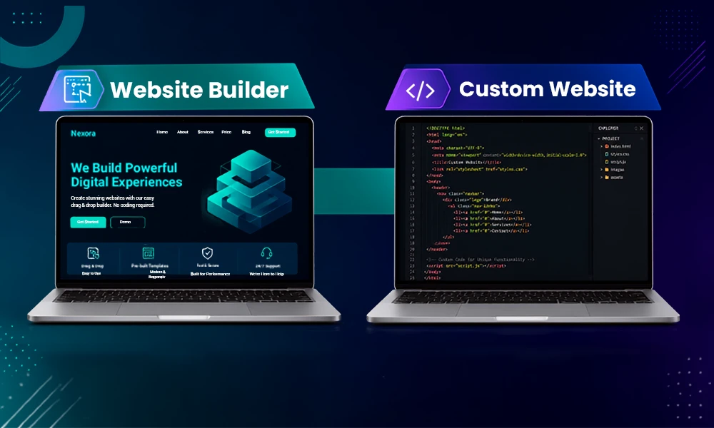
You might have wandered around so many websites on the internet for various reasons like entertainment or shopping, but there will be only a few that you trust or use the most. However much you love the platform, the factor that kept you hooked all around was the responsive design in its entire ecosystem.
In most cases, it is responsible for improving engaging elements and boosting the conversion ratio by adapting according to user accessibility. But there are some more aspects to discover, which we are going to cover in this detailed guide by Digitaladdex. A well-planned responsive experience starts with professional web design services that consider usability, visual consistency, accessibility, and device compatibility from the beginning.
What Is Responsive Web Design?
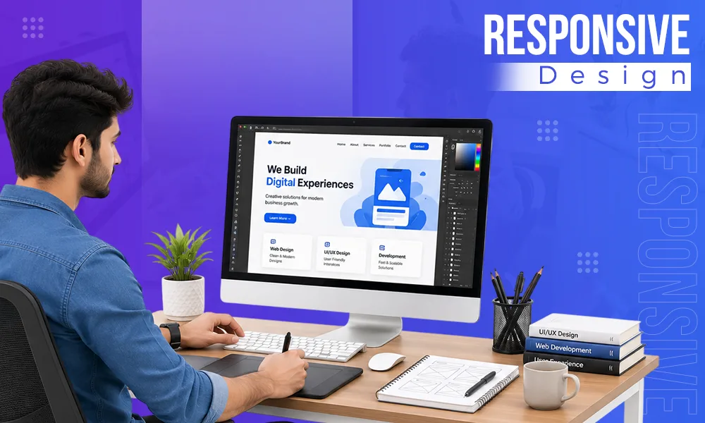
Responsive web design is a term used in web development for making online websites and applications adjustable according to different devices that users search from, like mobile phones and tablets. Responsive functionality is an important part of modern website development services because businesses need websites that perform consistently across desktops, tablets, and smartphones.
A responsive design in any software is achieved when its layout is optimized with versatile images, tangible fonts, and elements that provide haptic feedback in the navigation of the website for visiting users.
What Is a Responsive Website?
A responsive website is the foremost creation of all the responsive web design methods, which aims to deliver the same set of features, design language, color themes, haptic responses, forms, and listings on all formats of systems. For example, if you search Amazon weather on PC or a mobile phone, you will get the same buttons, toggles, listings, and features with just modified alignment according to your screen size.
How Responsive Web Design Works

Responsive web design is a multi-dimensional approach, as its primary aim is to make user-friendly online sites that can adapt into their desired format and visual appeal. But if you take a closer look, it primarily works on four algorithms, and they are responsible for making websites readily available and optimized for every device in the market. Below, we have decoded them briefly.
1. Flexible Grid Layouts
Flexible grid layouts are categorized units of measurements which allows you to limit the size occupied by elements of the web designs without the complexities of decreasing or minimizing pixel depths and using code to fix their alignments. For example, if you tweak the image placed in a container at 50%, then it will implement the same setting in other devices like mobile or tablet without any external code mapping.
2. Flexible Images and Media
Images and video playbacks are scaled to 100% in any container design to ensure that they don’t cross paths with other elements like text or symbols to break the visual appeal. Simultaneously, it helps to manage the proportion of image sizes for mobile phones of different sizes so that they don’t wreck accessibility or toggle, which are built for registering user actions.
3. CSS Media Queries
CSS Media Queries are a cognitive computational function that is used for determining the screen size and pixel density of the user device and showing layout results that completely align on their screen for getting the best user experience and refined toggles for performing all the necessary toggles.
4. Responsive Typography
It is obvious that a user checks out the website by reading all the content present there, which gives them curiosity to explore other domains of your platform, and that’s where responsive typography comes into play. It redefines the sizes of the text present on the website to ensure that readability on all devices is optimized and alignments are completely maintained so that a visitor won’t miss out on any information and frequently reacts with all the sections present.
Read more: Best Web Design Software in 2026: Top Tools for Creating Professional Websites
Responsive Web Design Best Practices
If you want to make a website with the best user experience and conversion, then there are some factors that need to be fulfilled to get the best output for the users. Some of the important metrics that make the ideal product are:
1. Design Mobile First
Mobile optimization of any website is very integral nowadays as it accounts for 54% of overall search engine queries (By StatCounter), and people are relying more on their handheld devices rather than sit next to their PCs and browse across thousands of pages. Neglecting this parameter can make your growth static or even reward you with poor web-based metrics.
2. Use Flexible Layouts
Using flexible layouts is necessary as these units blend perfectly according to different sizes of mobile or tablet screens, which brings an ideal user experience to every visitor and promotes engagement. Also, they allow for segmentation of all the elements and won’t let them overflow.
3. Optimize Images
Ensure that you optimize your web page images regularly according to trends or topics, as it creates a better visual understanding among the audience. Use alt tags and titles before every image to make them intriguing, and if possible, add links to the sources.
4. Improve Loading Speed
Slow loading speed drastically reduces audience retention and engagement as people don’t wait for too long to land on any web page. Responsive performance also requires ongoing monitoring after launch. Regular website maintenance services can help businesses identify performance issues, broken elements, outdated components, and compatibility problems before they affect users.
5. Make Touch Targets Larger
Making touch targets larger helps to improve click responses for CTA buttons because when they are small or presented in uneven areas of the screen, it makes it hard for users to find them and get forwarded to the next step.
6. Choose Readable Typography
Always select readable fonts that are not too bold or too light because anything in between is considered for improving readability. Ensure that all the information is formatted with proper headings and title case to make your content more professional.
7. Test Across Multiple Devices
Before deploying your website with responsive design on the internet, always do the testing of the final output on different devices, including mobile phones, tablets, laptops, etc to ensure correct optimization for each modem. This also helps to identify potential bugs and glitches, making it easier to fix them in early stages.
8. Keep Navigation Simple
Keep the pattern of navigation as simple as possible because without it, the user experience gets completely ruined and people get frustrated while finding their solution. The best thing that can be done here is that your site’s navigation is beginner-friendly and all the core services are interlinked on the homepage.
Common Mistakes to Avoid in Responsive Design

Well, responsive web design techniques are highly useful today for boosting all the business and search metrics that are required for outperforming competition, but if some methods go wrong, then there are some mistakes that can occur, which cause a decline in the overall performance of your website.
- Fixed-width layouts that are not adjustable or flexible with different device modes are very concerning in today’s website framework, as images act as the first aesthetic that is used for hooking traffic and intriguing them about the things mentioned on the site.
- Poor font or inappropriate font sizing can make your texts and calls to action unreadable and demote the quality of articles, product listings, and all resources present on the platform.
- Ignoring landscape mode is the biggest negligence that most new website makers do today and ruins user experience to some extent, as many people prefer using their devices horizontally instead of vertically for better viewing angles.
- Sometimes not testing responsive elements and the overall final output on real devices can lead to severe alignment issues, bugs, glitches, and background issues, which cause a severe drawback in front of your visitors.
Popular Tools for Responsive Web Design
Today, countless tools can enhance the responsive design of your website, but there are only a few that are actually capable of making integration and changes according to personalized user needs and audience retention trends. Here are some popular expert suggestions we are putting here that you must check out:
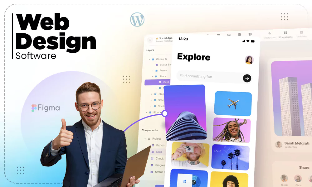
- Figma: It is a web-based tool that features immersive layouts and tools that allow you to make responsive and flexible websites using the mimics of CSS flexbox.
- Adobe XD: Empowered by its parent company, Adobe, this utility offers unique features, elements, and accessibility, which makes resizing resources easier than ever before. It uses functions like Stack and Repeat Grids for creating unique haptic responses.
- Sketch: Sketch is an ideal tool for macOS users for creating haptic friendly, responsive website for multiple purposes. This tool features so many creative additions and necessary layout elements.
- Bootstrap: It is a mobile-centered framework that uses a 12-column grid system for creating immersive layouts and stretches elements using its adaptive algorithm based on a CSS library.
- Webflow: This tool is the most beginner-friendly tool on the market after Figma, as it contains so many drag-and-drop features for creating flexible and responsive designs using HTML, CSS, and JavaScript designs.
Read more: DIY Site Builder: The Complete Guide to Creating a Website in 2026
SEO Benefits of Responsive Websites
Responsive websites play a pivotal role in uplifting your overall search engine ranking and credibility amongst your competition, as the metrics are mostly centered around making the user experience better, which leads to improved conversions and profits. Some of the impactful benefits are:
- Better mobile usability for users who have searched their query on mobile and want to experience your site in the palm of their hand without the hassle of carrying laptops all day long.
- Faster page speed rendering, which won’t make them lose connection with your platform and keep them hooked and intrigued about the answers, services, or products that are being suggested according to search results and keywords.
- It also improves core web vitals such as domain authority, page authority, security parameters, search engine indexing, click-through rates (CTRs), alt tags, meta badges, etc which makes the websites more relevant on the search pages and showcases your site on answer engine overviews.
- A good, haptics-based, responsive design, clean toggles, properly functioning call-to-action buttons, navigational accessibility, refined images, and definite texts allow users to stay for a longer time on your website, which ultimately makes it more popular and distinguished.
Your website also gains better user experience signals like good reviews about your content, products, or services, which are highly beneficial for any business to grow on the internet.
Is Responsive Design Still Relevant?
The importance becomes even greater for large organizations managing complex digital platforms. Enterprise web development can incorporate responsive architecture, scalable interfaces, and consistent experiences across the many devices used by employees and customers.
It also improves consumer visibility, searches, navigation, accessibility, and server loading times, which is important for sustaining businesses on the internet and growing them in different regions of the world.
On the other hand, elements like fluid grids and flexible images give a clean user experience and static appeal that is important for maintaining the credibility and reliability of your online platforms.
Frequently Asked Questions
What is responsive web design?
Responsive web design (RWD) is a type of approach in web development that is applied to make websites flexible and dynamic according to different devices by modifying text, images, haptics, CTAs, etc.
What does responsive design mean?
A responsive design means it is engaging and provides a seamless experience to the audience throughout their navigation across different pages of a website, through haptic feedback, animations on pages, toggles, and other creative elements.
What is a responsive website?
A website is considered responsive when it can be easily adjusted according to different devices and its elements are perfectly aligned without breaking the user experience while also providing the same set of utilities.
What are responsive web design techniques?
Well, some responsive web design techniques are being heavily used in today’s modern era, which are:
- Fluid Grids
- Flexible Images
- CSS Media Queries
- Mobile-First Design
- Breakpoints
- Responsive Navigation
- CSS Flexbox & Grid
Why is responsive design important?
Responsive design plays a pivotal role in 2026 as it improves some impactful metrics like mobile user engagement, SEO, conversion rate, lag free experience, which makes users stay longer on a particular domain
What is the difference between responsive and adaptive web design?
Responsive web design uses fluid grids and CSS media queries to make flexible designs according to the user’s device, while adaptive ones configure different screen sizes and adjust their layouts.
What are the best practices for responsive web design?
The best practices for responsive web design include attributes like:
- Mobile Optimization
- Flexible layouts
- Image Optimization
- Improving loading speeds
- Ease in touch targeting
- Adding readable fonts and texts
- Device testing
- Easy navigation
Does responsive design improve SEO?
Definitely, it improves all the crucial metrics of SEO like conversion rates, audience retention, and many more aspects by blending seamlessly with all user devices and improving rendering speed.
Conclusion
Responsive design in websites adds a special kick to your platforms through various haptic feedback, animated toggles, text, etc., which drastically improves UI and UX satisfaction, making users stay longer and generate more profitable inputs. Also, never forget to prioritize mobile optimization, as most searches are conducted from phones instead of pc and laptops.
While integrating responsive design techniques, always test on different scenarios and devices to identify vulnerabilities before publishing your site on online domains. Lastly, stick with Digitaladdex for more such awesome content.
Sources:
- Responsive web design basics: The essentials. By Adobe For Business
- Responsive design techniques by Microsoft Learn